PROSPERAR
what we developed
branding strategies | visual identity | brand language | social media language
Prosperar was born with a clear purpose: to promote prosperity as a state of mind and a tool for social transformation. More than a nonprofit organization, the brand positions itself as an ecosystem of socio-environmental and educational businesses, connecting initiatives that generate positive impact and financial sustainability for its affiliated entities.
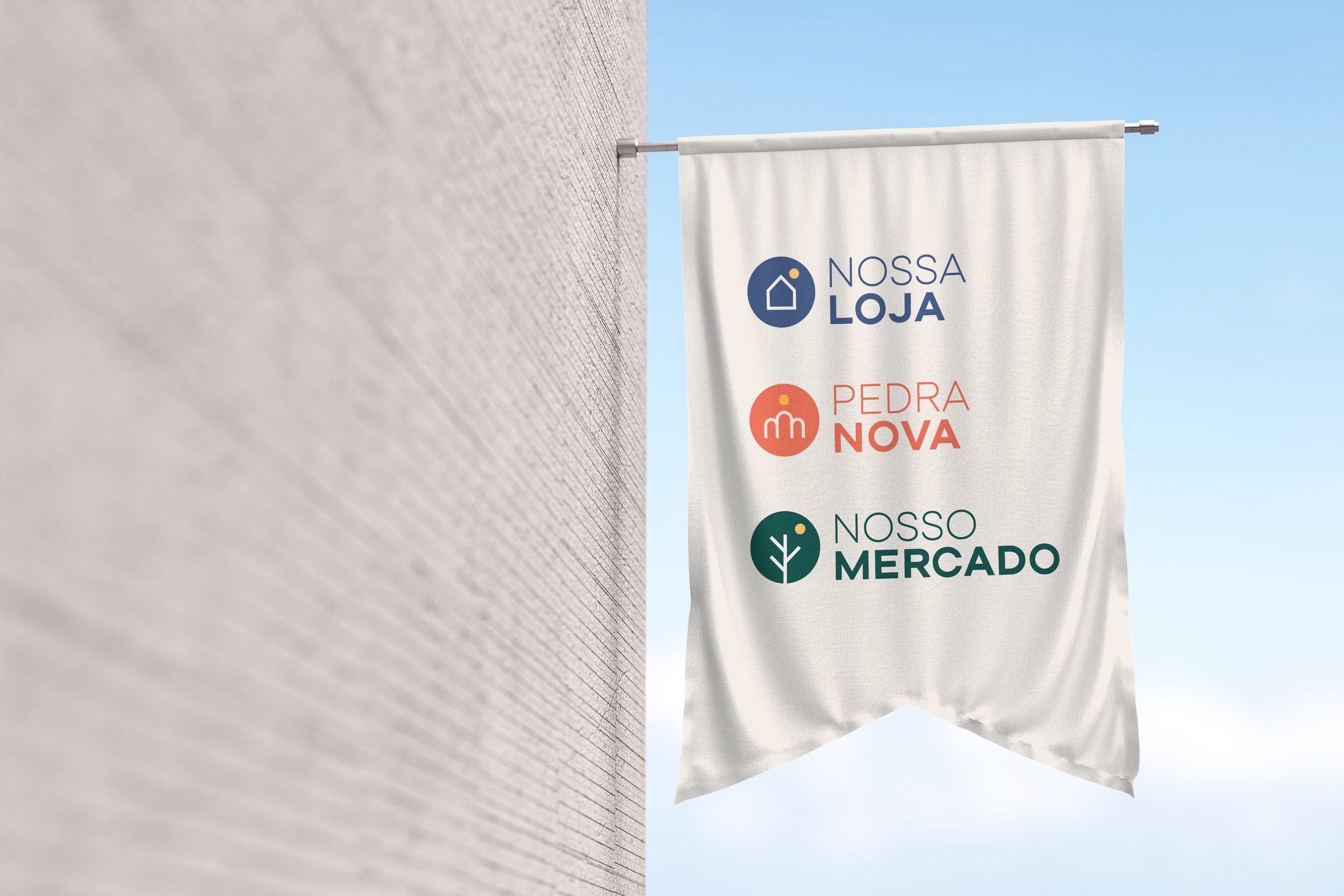
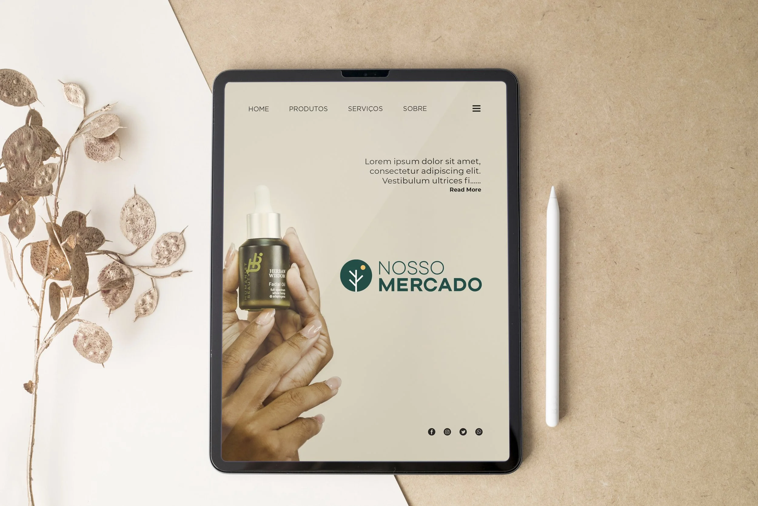
Our challenge was to translate this essence into a brand architecture that would bring unity, coherence, and flexibility to the Prosperar master brand and its sub-brands—Nossa Loja, Pedra Nova, Nosso Mercado, and Prosperar Bank. The goal was to create a visual identity system that reinforced their connection while preserving each brand’s uniqueness.
The new visual identity reflects this balance. The sun symbol, present in all the brands, represents vital energy, a guiding light that fosters growth and radiates new opportunities. The color palette was strategically designed for each sub-brand: yellow symbolizes action and movement; blue conveys depth and trust; green reflects connection with nature and sustainable growth. Neutral tones like beige and white ensure harmony and visual balance. The typography was refined to enhance modernity, accessibility, and alignment across the sub-brands, reinforcing a cohesive communication strategy. The logo designs embrace simplicity and clarity, conveying values such as proximity, social impact, and transformation.
The result is a solid, cohesive identity, designed to expand Prosperar's reach, strengthening its role as a driving force for a more balanced, inclusive, and sustainable future.


Motion for the Nosso Mercado Marketplace Logo
Logo Animation for Pedra Nova Book Publishing
Logo Animation for Prosperar Bank