PASSARIM
what we developed
branding strategies | visual identity | brand language | patterns | stationary | social media language
Passarim is the signature brand of designer Bella Teles, born from a childhood dream: to one day create her own stationery line. Years later, that dream became reality—and took flight toward new creative horizons.
The brand was built on a branding process that honored its essence—with strategies that shaped a clear, original, and sensitive positioning, revealing a visual identity that is both refined and deeply personal, in harmony with Bella’s creative vision.
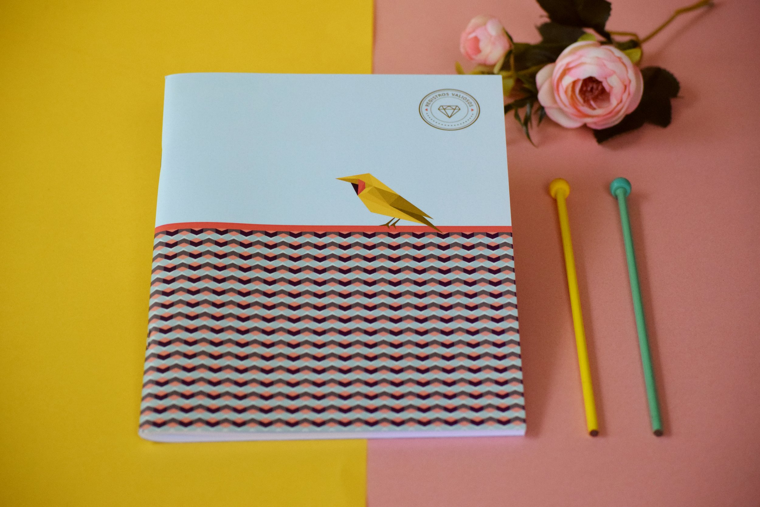
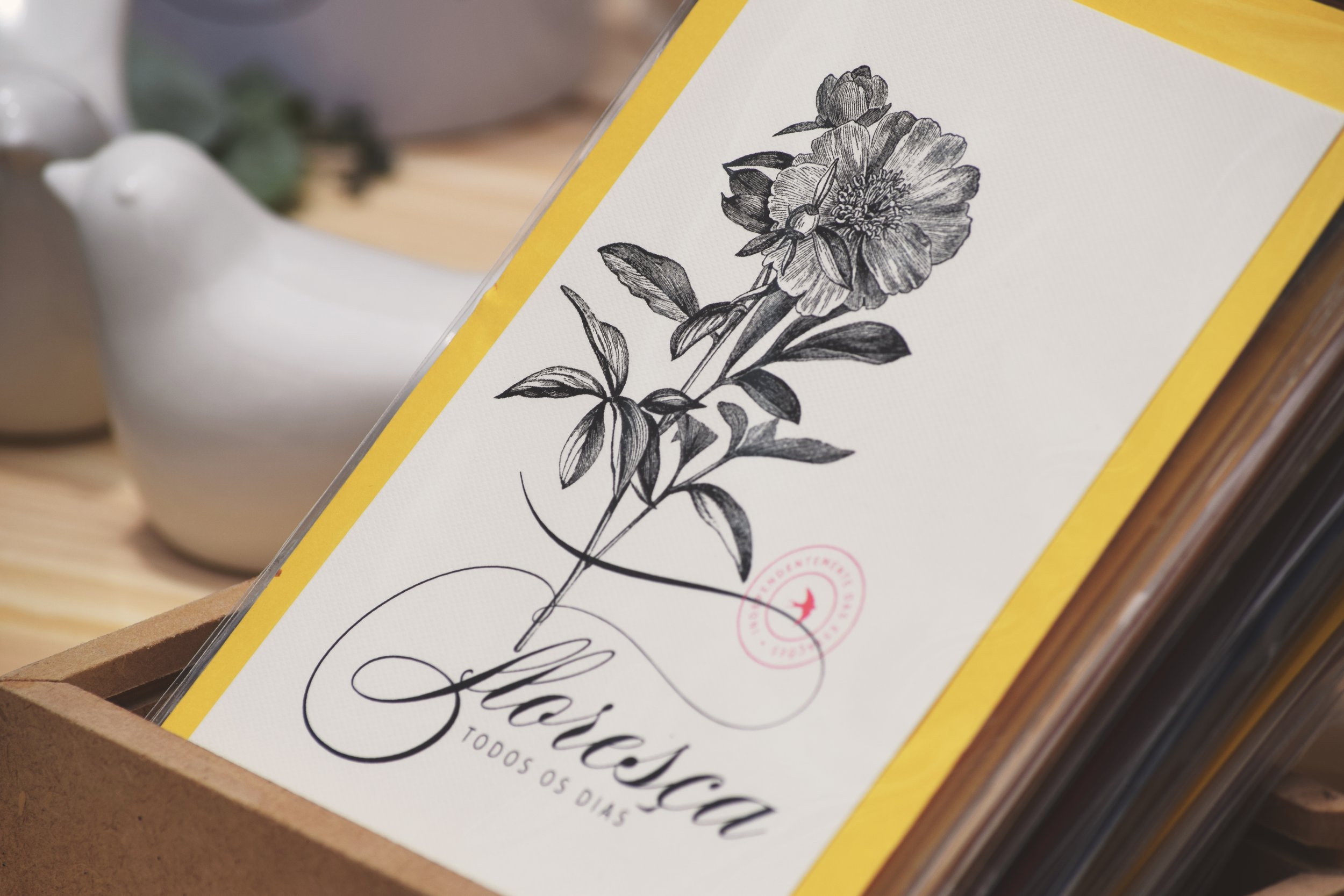
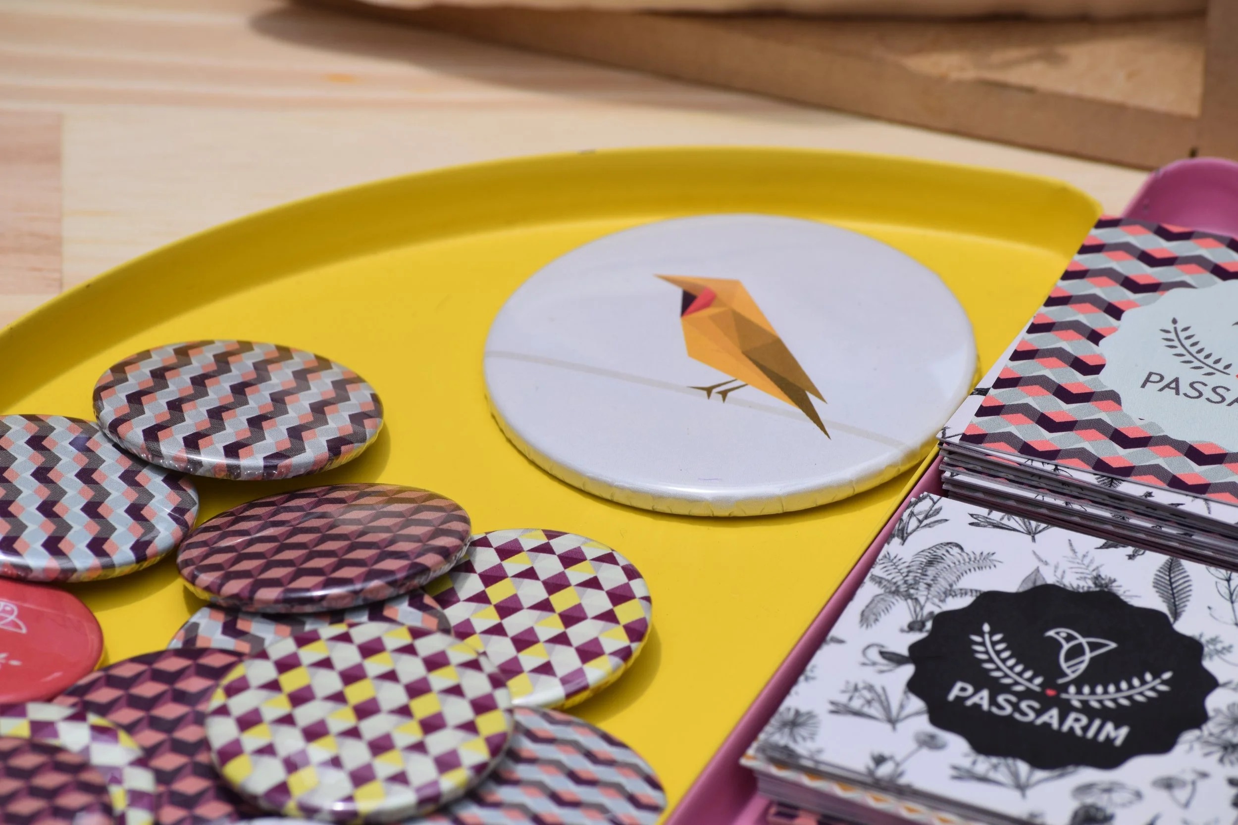
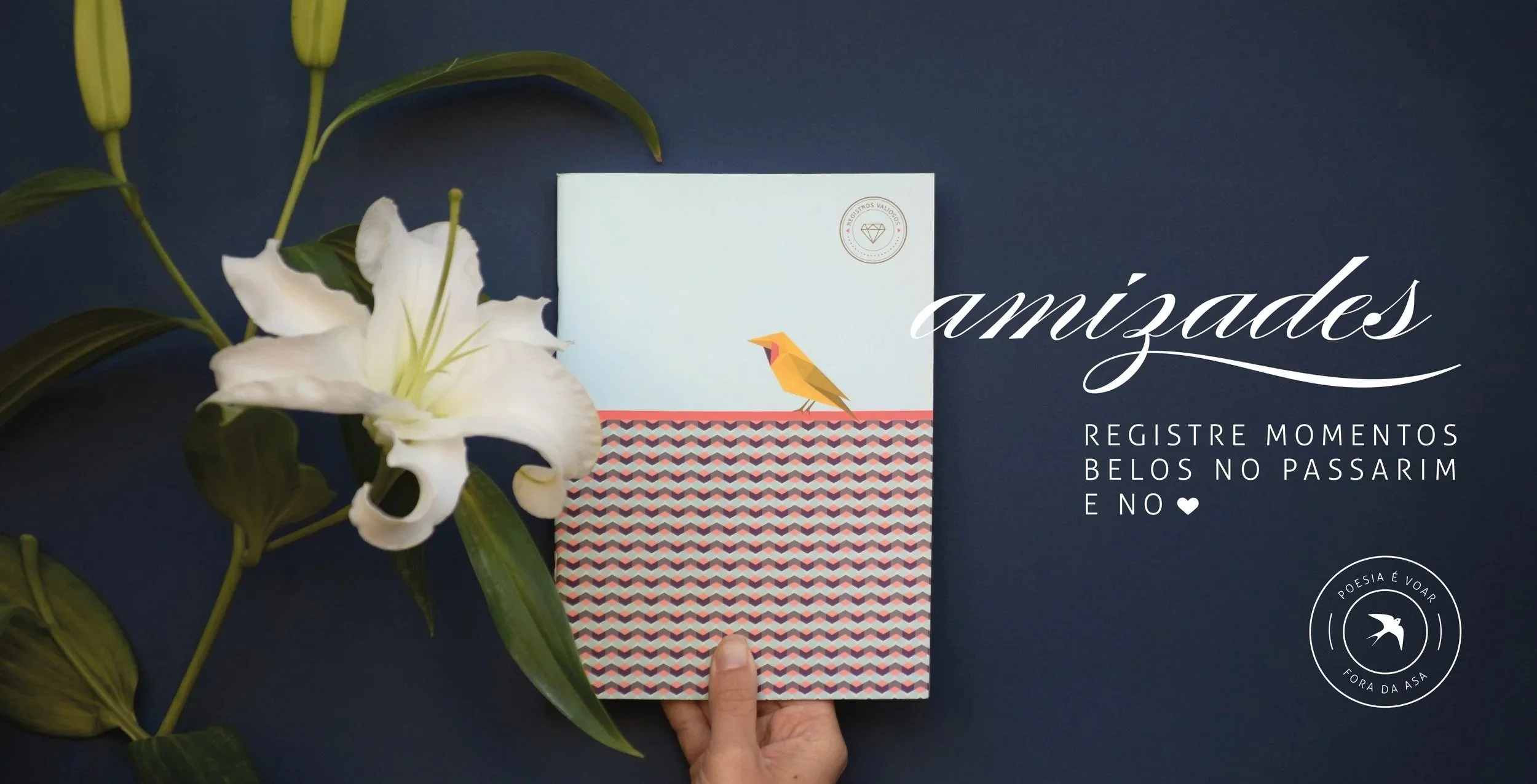
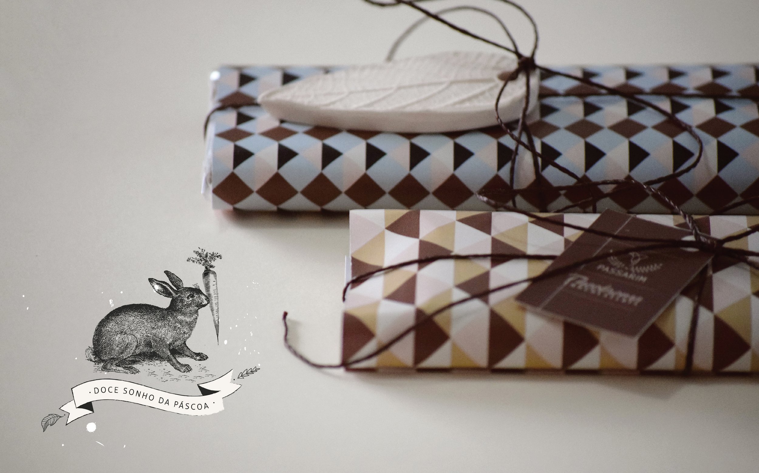
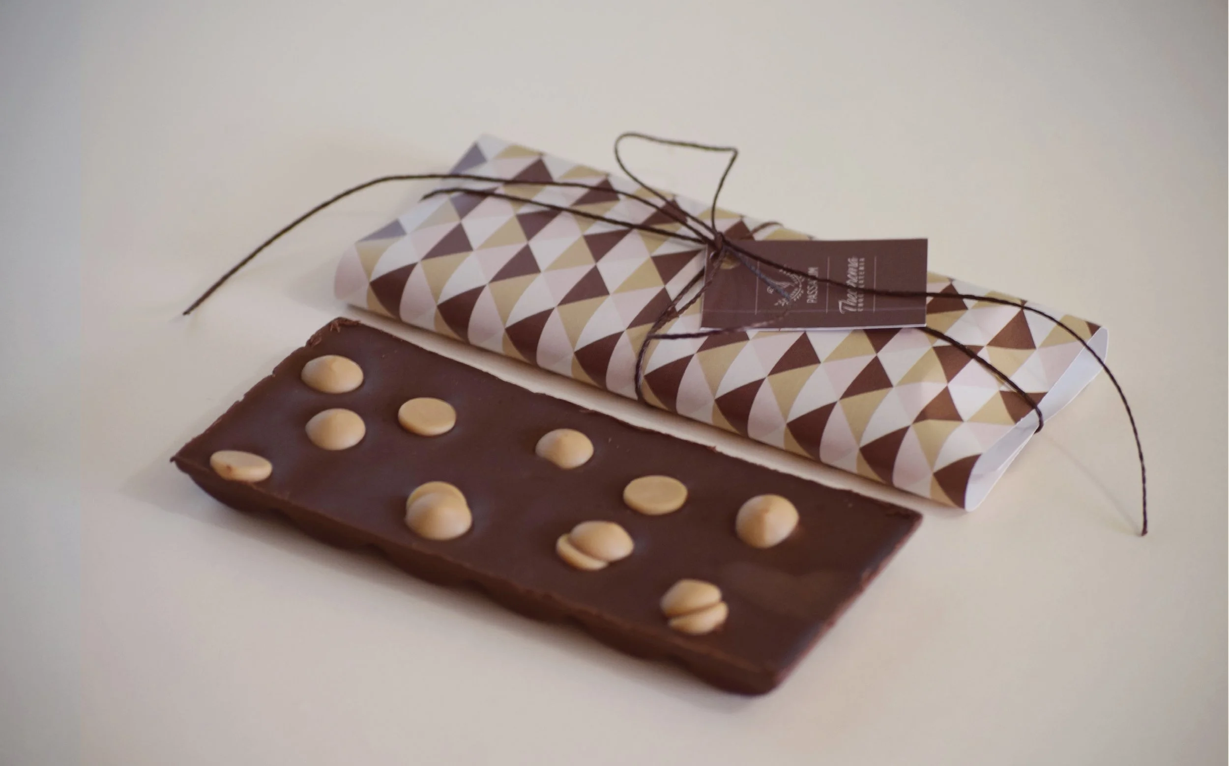
The identity draws on a love for nature and a strong connection to origin. The name Passarim comes from the affectionate way “mineiros” (people born in the Brazilian state of Minas Gerais) refer to a little bird—setting the tone for a brand that is light, poetic, and full of charm. Botanical illustrations blend with soft geometry, in a visual language rich in textures, delicate colors, and special finishes.
Over the years, each new collection launched by Passarim brought a different theme, but the thread running through all of them has remained the same: nature as both inspiration and art. The result is a line of stationery and home decor products that carry more than just visual appeal—they carry soul, poetry, and intention.