Dra. AJNA GUADALUPE
what we developed
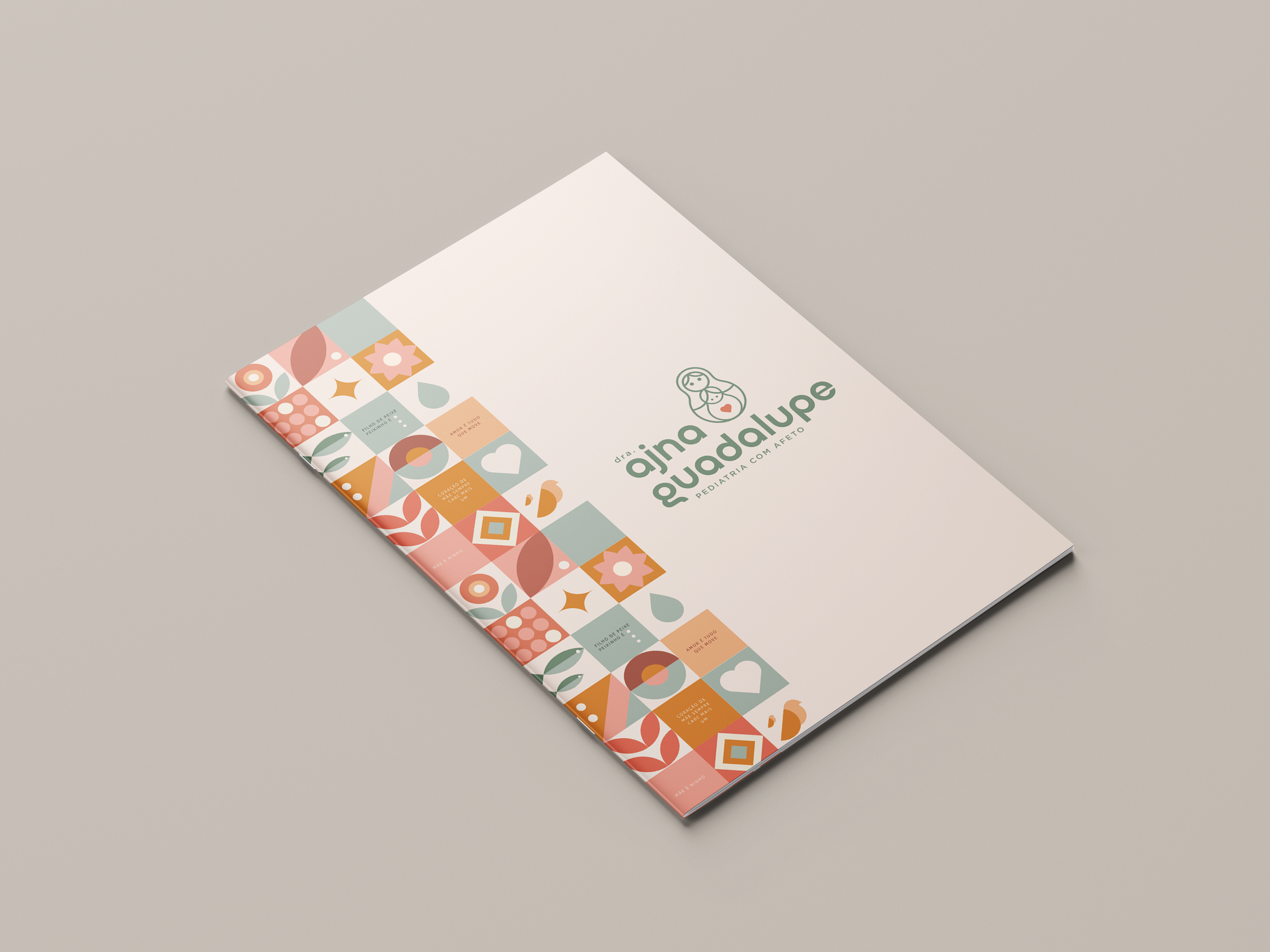
visual identity | brand language | social media language
The Dr. Ajna Guadalupe brand was created to represent a pediatric approach that embraces, listens, and walks alongside families—with science, presence, and love. A mother to Flor and a pediatrician trained at the Hospital das Clínicas of UFMG, Ajna is an advocate for respectful, humanized birth and sees motherhood as a path for both personal and collective transformation.
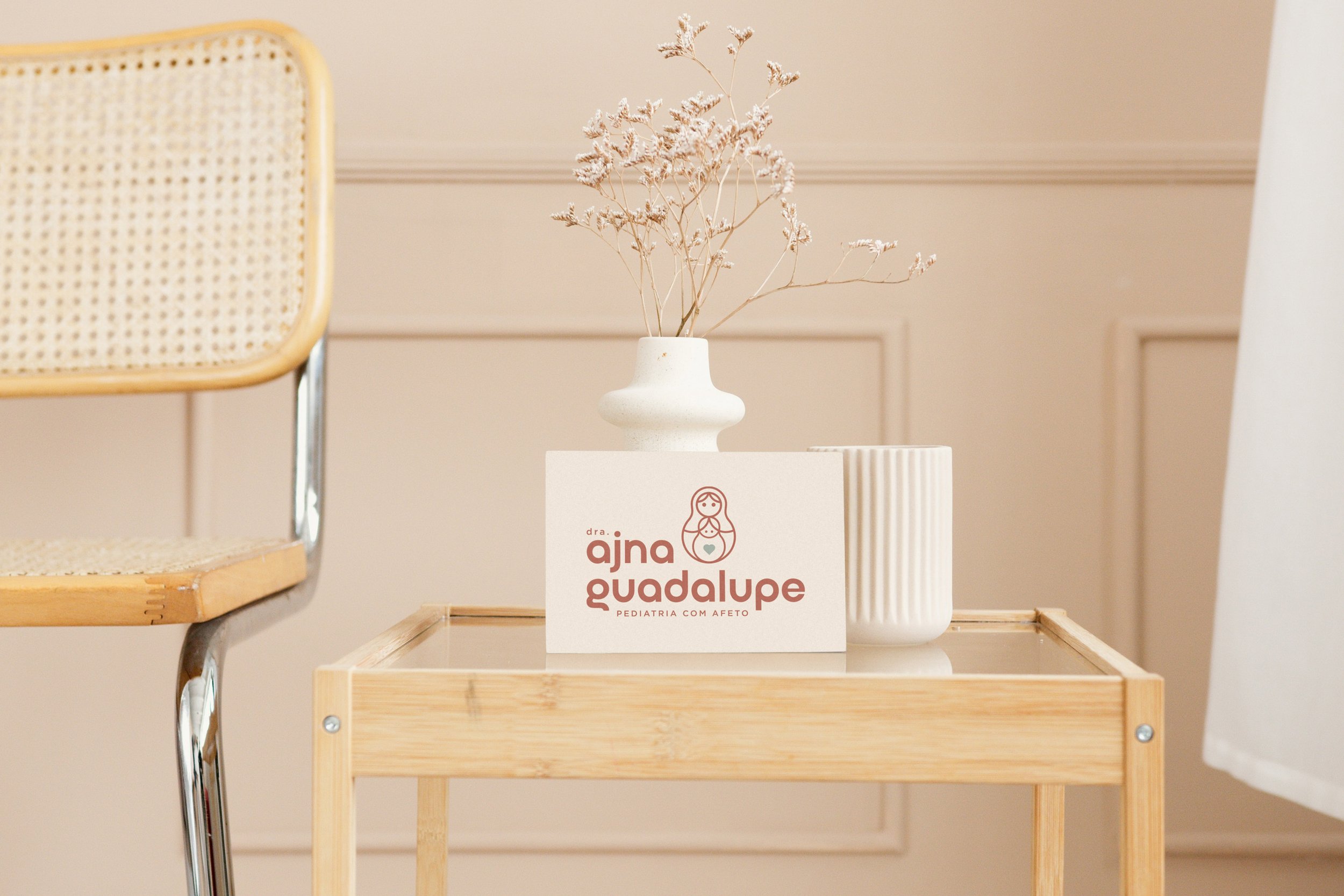
Inspired by principles like secure attachment parenting, positive discipline, nonviolent communication, and conscious parenting, her visual identity reflects this loving, integrative vision of life. The symbol evokes a nest, a Matryoshka doll, and a heart that welcomes—all representing layers of protection, affection, and light centered around life.
Organic shapes, a soft color palette, and delicate illustrations convey lightness, continuity, and the cyclical nature of birth, growth, and connection. The typography, with its handcrafted strokes and fluid curves, adds warmth and clarity to the brand’s communication.
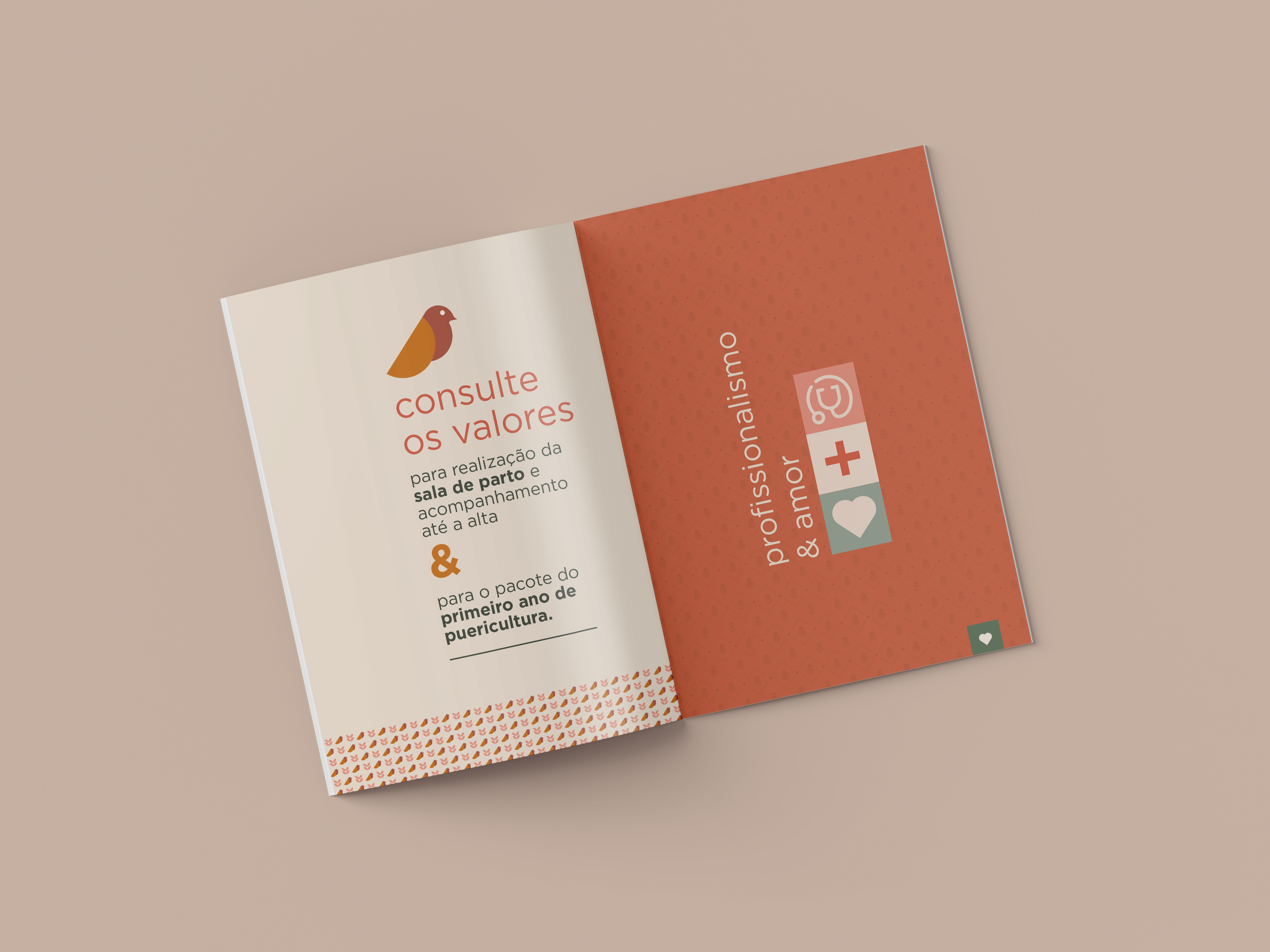
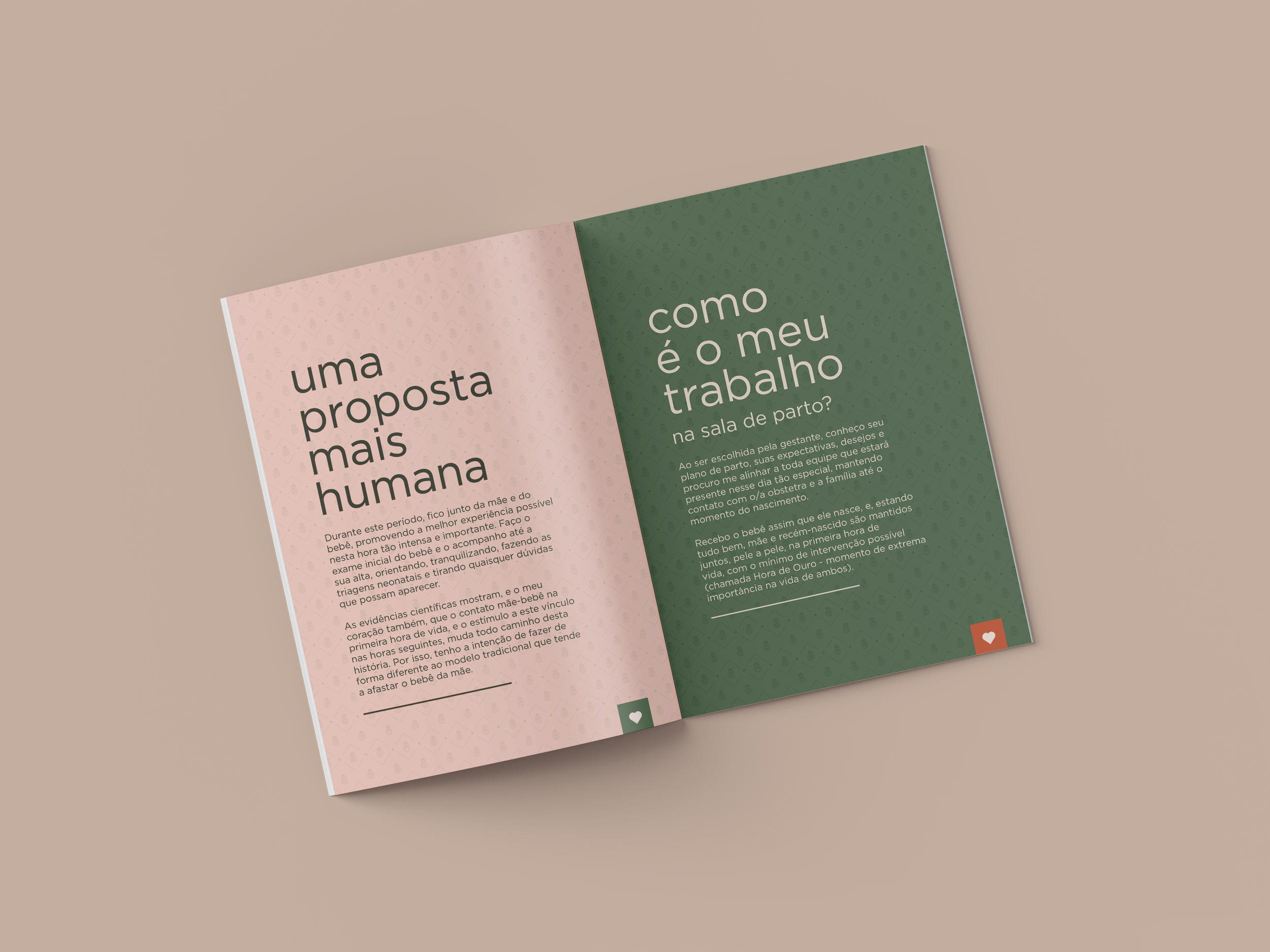
Beyond the visual identity, we developed the entire brand ecosystem: business stationery, commercial presentations, promotional materials, office signage, and a cohesive visual language for social media—strengthening Dr. Ajna’s presence at every touchpoint with the families she cares for.