Dra. FERNANDA FERREIRA
what we developed
branding strategies | visual identity | brand language | social media language
The brand of Dr. Fernanda Ferreira was born from a desire to care for the skin with depth and honesty. Her approach goes beyond aesthetics, inviting patients on a journey of self-care, where health, balance, and personal responsibility walk hand in hand. Here, beauty is the natural result of conscious and lasting choices.
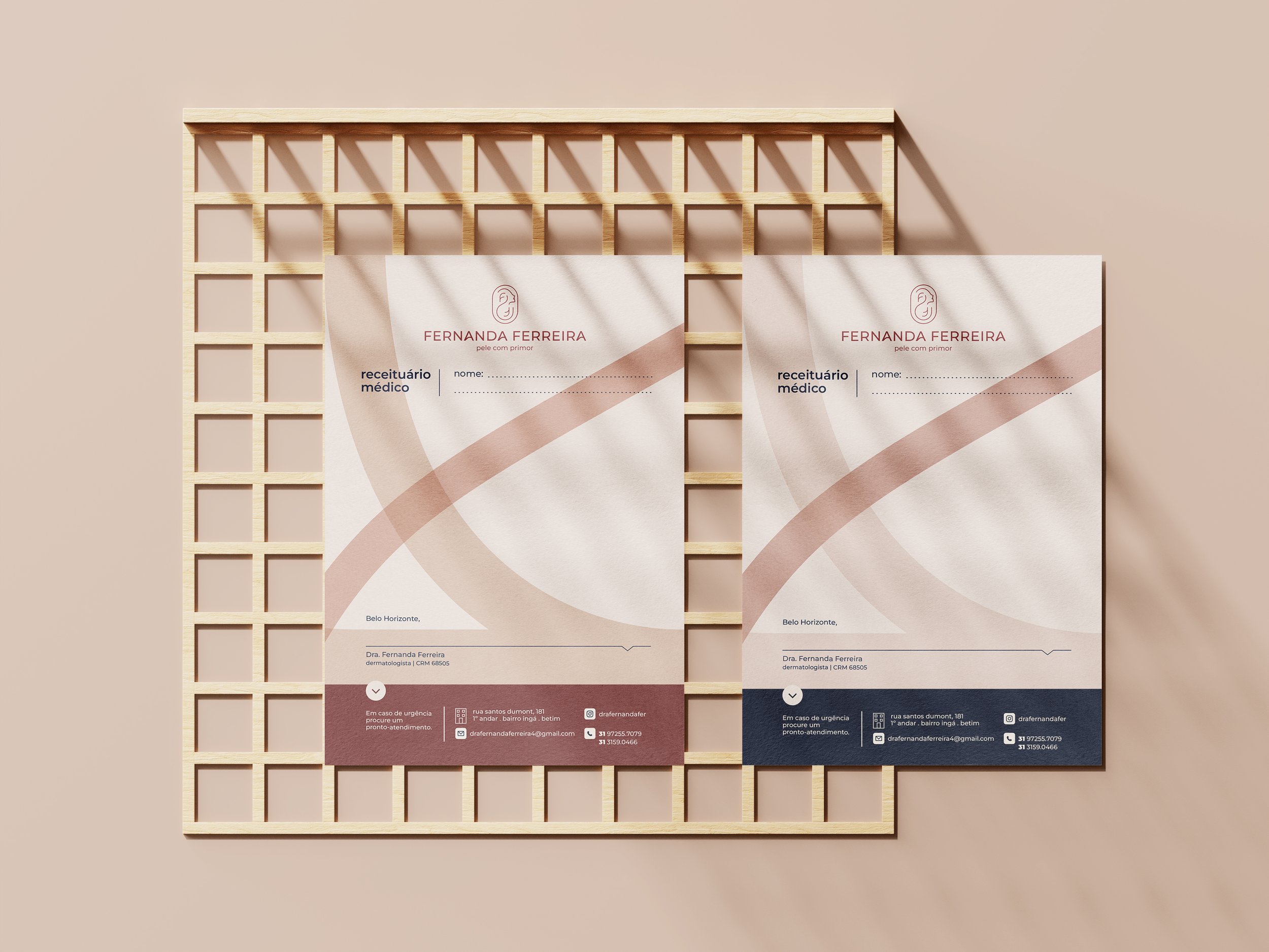
The visual identity was crafted to reflect this universe: organic shapes that embrace and connect; a color palette inspired by skin and earth tones, conveying balance, empathy, and trust. The symbol unites body, movement, and the initials of the doctor, reinforcing her thoughtful and human-centered practice.
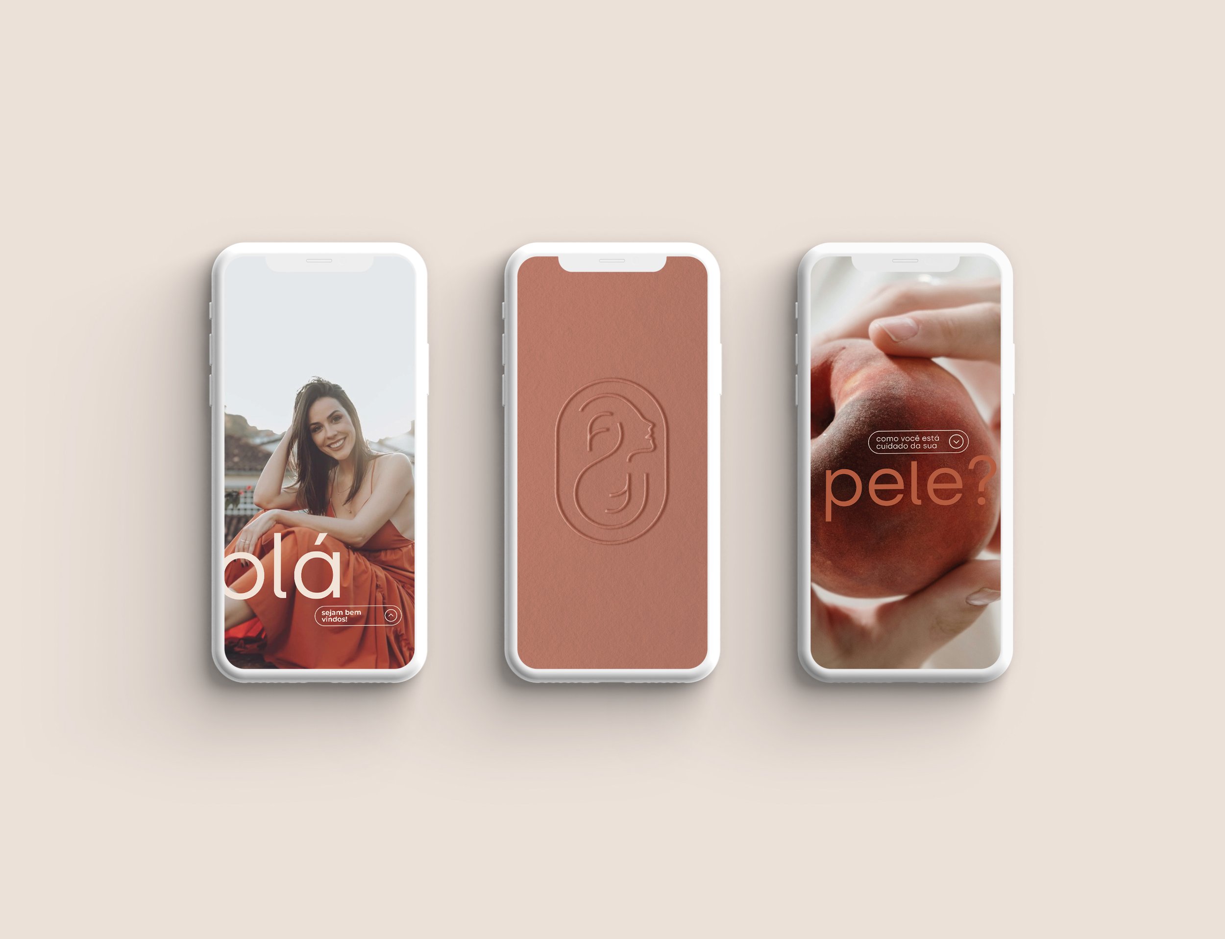
From stationery to physical space, from digital presence to social media, every touchpoint was designed to reinforce a brand that is honest, sensitive, and enduring—just like the bond built between doctor and patient.
Every detail speaks of purpose. From the welcome at the clinic to digital content, everything expresses a medical approach that listens, investigates, and walks alongside the patient—with calm, ethics, and care.